Jack V. Elliot Air Service
 The Swastika on Stamps
Before the swastika was adopted by the Nazis, it was thought of in a much different light.
Derived from Sanskrit, the ancient and sacred language of Hindus in India,
svastika means "conducive to well-being" and for thousands of years
has been used as a good luck symbol in many cultures all over the world.
Many Indian nations in South, Central, and North America favoured this symbol,
and several early 20th century companies featured it on their products,
including some issues of the Jack V. Elliot Air Service.
More
Even More
|
Jack Elliot began flying in western Ontario by providing passenger and exhibition flights at the various county fairs. He read about the difficulties that prevailed in northern Ontario in getting men and supplies into the Red Lake gold mining region. He applied to the Post Office and was quickly granted permission to launch his service in March 1926. Using two Curtiss JN-4's he offered daily service until Apr 15 when the dangerous spring thaw arrived.
The first unremarkable issue, caCL0006, was printed on yellow paper with a "zig-zag"
and the second with a swastika background (see article at right).
The company's name and function was displayed between vertical rows of leaves.
These backgrounds were first printed on sheets containing eight separate panels over which were printed two vertical stamps. They were printed by lithograph at the offices of the Toronto Star (from printer's waste). These were then overprinted in sheets of 16 with 2 panes of 8 in horizontal tête-bêche position. They were printed from a block of 4 cliches repeated over the rest of the sheet.
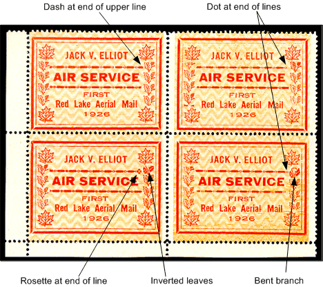
Each cliche in the block has a distinct variation in the stamp design. Imperforate sheets are known.
 |
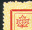 |
| Zig-zag on caCL0006 background |
Swastika on caCL0007 background |
Essay
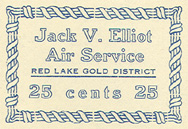 |
At left is a disapproved essay in blue on white paper.
It was prepared for use by the airline but was rejected by the Post Office as it carried an actual denomination of 25¢.
Carrying a denomination was prohibited at the time but was used by Yukon Airways in Nov 1927.
A small printing was made (40 have been reported) and most were used on postings from Kitchener on March 2 by collector A. Berberich.
The new CL6 had to be used over the essay.
On some covers the essay was left intact; on others it was partially torn off.
Note: C.A. Longworth-Dames, in The Pioneer and Semi-Official Air Mails of Canada 1918-1934 (page 71),
maintains that these labels were privately produced and have no connection with the company.
|
Constant Plate Varieties
| The four designs differ primarily in the "dot-dash" formation above and below the words "AIR SERVICE" and in the vertical columns of holly leaves to the left and right of the design. It is apparent that both these patterns were cut from longer strips, which would account for the foreshortening of parts of this portion of the design. The inclusion of a rosette at the end of the upper line on Stamp No. 3, to fill the gap that would otherwise have occurred, was an accepted practice with printers of this period.
|
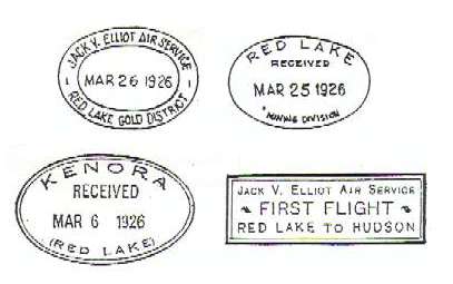
| Because of the importance of the Red Lake gold fields, the Ontario Department of Mines designated a separate mining division for this district.
Two markings were prepared - possibly by Jack Elliot, who had been appointed temporary Postmaster as Red Lake.
These markings were briefly utilized as temporary Red Lake Post Office cancels, though some collectors refer to them as "cachets".
The top left double-oval marking commands a 50% premium while the single-oval marking commands a 100% premium.
|
|